Point Line Plane
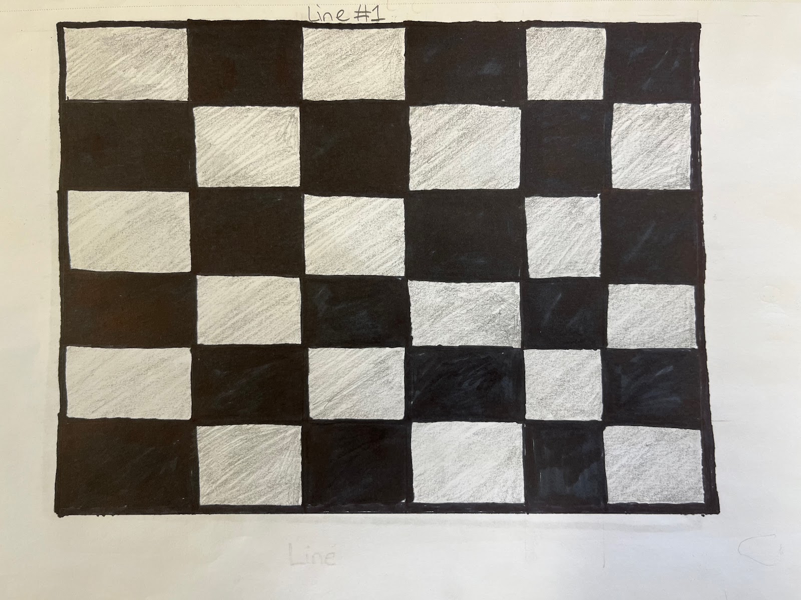
This is image #1. It is a line drawing. The reason I made this is because firstly it was simple. Also because it was a great way for me to get into the drawing mood to do the rest of the 7 finals that are shown.
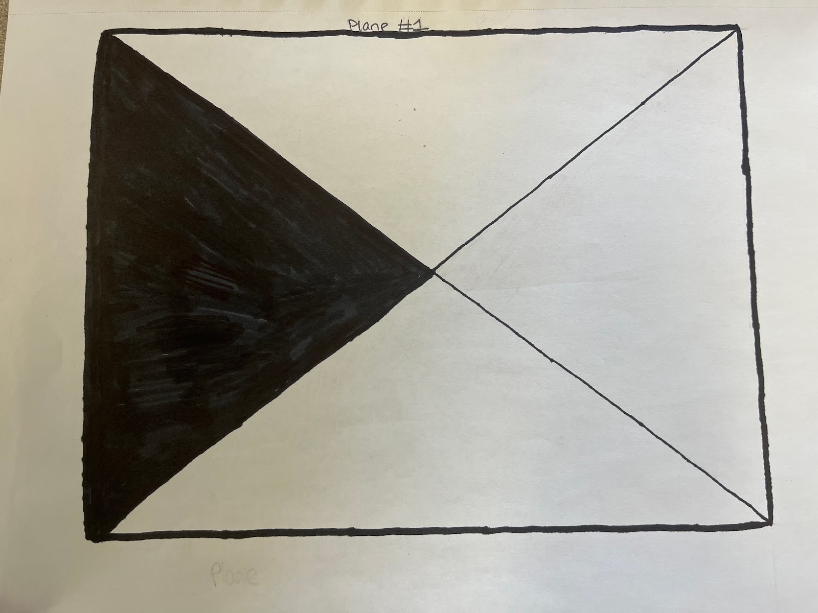
This is image #2. It is a plane drawing. The reason I made this is because I was thinking about shapes and triangle came into my mind.
This is image #3. It is a point drawing. The reason I made this is because I was thinking about a mountains landscape. I wanted to find a way to implement it with point line plane and this is what I came up with.
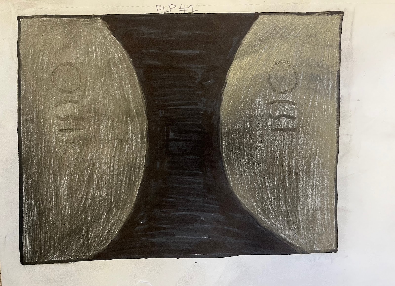
This is image #5. This is a point line plane drawing. Originally, it was just the thing in the middle and no O and lines at the sides. At the end of this project, I decided to implement these lines to make it more interesting. This was the one that took me the longest because making the black part was a lot more difficult than expected.
This is image #6. This is a line drawing. For this final, I just drew what I sketched randomly. I just sketched random lines and I thought it was nice enough for it to be in the final 8.
This is image #7. This is a point drawing. I was just making circle and I kind of made a square with them which I thought was nice.
This is image #8. This is a point line plane drawing. You can obviously tell the lines and the points because of the square and the circle. But the way that plane is here is because all shapes are mirrored with each other. You look at the rhombus on the left and theres one at the right and the same for the circle, and the same for the square. I was originally going to put a triangle instead of a rhombus, but, I personally felt that I already used triangles enough and I wanted a shape more interesting that people wouldn’t use as much.


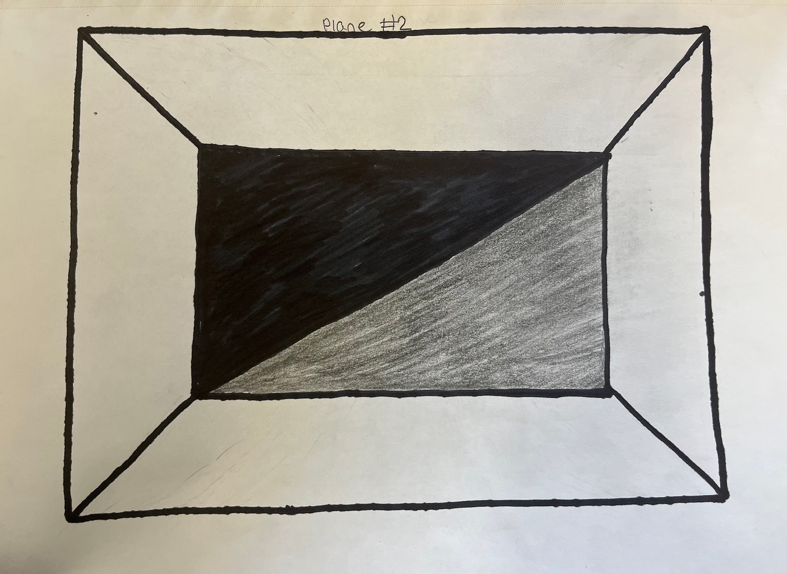
Point, Line, Plane #2 looks poor because I considered the drawing to be boring as the shapes aren't symmetrical with one another and the shapes are not the same size. Out of all the 8 drawings Line 1 is the best because the checkered board pattern looked cool and the shading in the white squares add a flare to the drawing.
ReplyDeleteThis comment has been removed by the author.
DeleteI'm sorry. I will make sure to make a drawing so amazing that it will be compared to Picassos paintings.
Deletemy fav one is the first one cause it looks the most organized and clean
ReplyDeletemy least fav is image 6 because it just looks like really in and uneven
Thank you for your opinion! I made image 6 in 5 minutes because It was due.
DeleteI like the image 3 because its looks like a painting
ReplyDeleteI like plane 2 because it looks like a box.
ReplyDeleteI like Line 2,the shading is really well done and I liked how you also used wavy lines it looks awesome. My least favorite is probably PLP#2,I think you could add more to the drawing and its pretty simple although I shouldn't be talking but its very good.
ReplyDeleteThank you for the advice!
Deletei don't like image 6, the shading in truly ruins the whole thing. I feel like if you got removed of all the shading and just added a bit a contrast it would've looked a lot better.
ReplyDeleteI really like image 3 i feel like it's the perfect amount of contrast at the perfect place and i feel like it really complements the whole thing and makes it look better
Thank you for expressing your opinion! I will take note of the criticism you have given to me.
DeleteI really approve of image #9 because of I really like the checkboards and how neat they are.
ReplyDeletemy favorite is image 4 for the color blends well together and my least favorite is image 7 for it looks like you did not do much and seems empty, next time try to make new shapes or make them bigger so it won't look empty.
ReplyDeleteThanks for the feedback! I will try to make sure my future drawings are not as empty.
Deletei like the first one it reminds me of chess
ReplyDeleteImage #5 could have been done better with the semi circles because they aren't semetrical
ReplyDeleteI like image 4 because it looks interesting with the black and white
ReplyDelete